CASE STUDY
YouTube
Education Mode
Project Overview
Our class assignment involved individually selecting a problem to solve from a provided list of apps. I chose to focus on YouTube, aiming to enhance the platform for users primarily utilizing it for educational content. Recognizing that YouTube often prioritizes entertainment over educational materials, my goal was to address this imbalance and improve the user experience for those seeking educational resources on the platform.

My Role
research, iteration, design and usability testing

Duration
3 Months

Team
Worked alone
Problem Statement
YouTube users who use the platform for educational content are struggling with YouTube’s recommendation algorithm because it prioritizes entertainment content over educational content. This can make it difficult for users to find relevant videos, which can hinder their learning experience and could cause users to leave for another platform.
Research
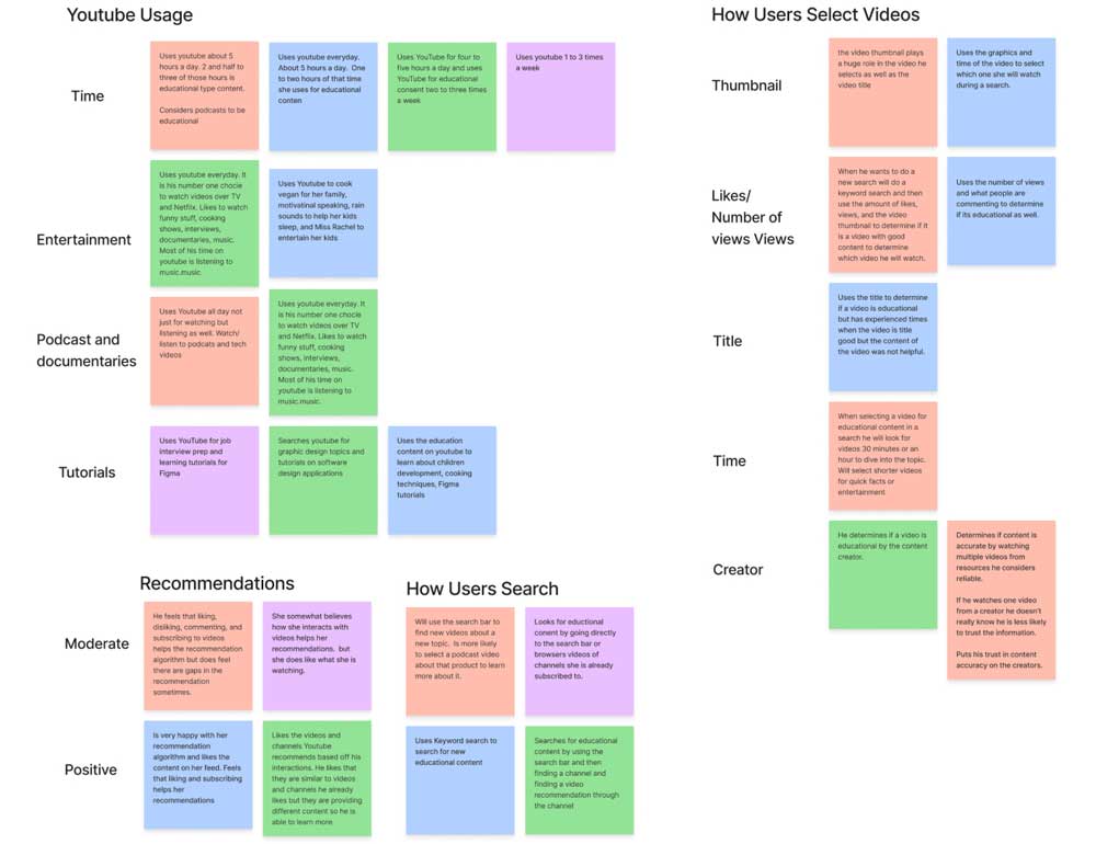
To comprehend and address the challenges users encounter when searching for educational content on YouTube and gain insights into their behavior, I conducted user interviews. Below are some key questions I asked, along with users’ responses:
Tell me about yourself and how you use YouTube in your daily life.
“Well, I actually use YouTube all the time. Every single day. There’s always something that I playing either in the background or I’m actively listening to. I will listen to either a podcast, or educational video something new to learn or Watch. I am really into tech, so there’s always some content, and I consume a lot of content.”
How often do you use YouTube? How often do you think you use YouTube for educational content?
“I say to give you a more precise answer, about five hours a day. I would say about half of that time, so maybe two and a half to three hours. Always listening to a podcast and I’m learning something new. So I consider that to be educational, or the podcast.”
How do you search for educational content? When you want to find something?
“Well, typically, I’m already subscribed to it but if I were to look for something new, I will look for a specific topic. So let’s say I’m trying to find out about a new product that just came out. I will search the name of the product. And if I happen to come across a podcast that’s talking about the product in detail, then I’m more likely to click on that podcast and maybe learn a couple new things.”
When you're searching for a new product, how do you determine which video you're going to select?
“I would say the thumbnail plays a huge role in that. If it’s something that’s striking, visually striking, I’m more than likely to click on that. Also the title of the video. It depends how its worded. Whatever strikes the eye at first.”
My Findings
Search Bar
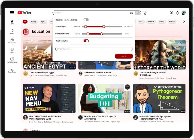
Users mainly use the search bar to find educational content.
Education and Entertainment
YouTube users use its platform for a variety of reasons.
Video Selection
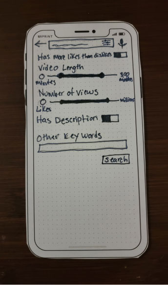
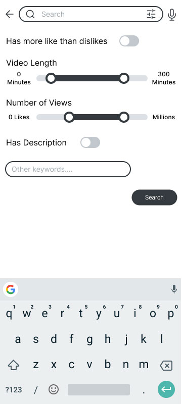
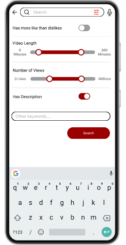
Users base their video selection on number of views, length, likes, description and thumbnail images.
Recommendations
Users for the most part like the recommendations YouTube offers.
My Hypothesis
If education-only features are added to the platform then users can remove entertainment videos during their search to improve the learning experience.
Ideation
User Scenarios and JBTD Statements
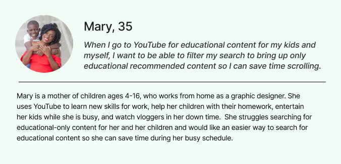
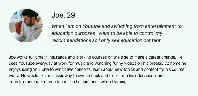
The initial phase of my ideation process involved crafting user scenarios and JBTD statements. Drawing on insights gathered during user interviews, I formulated two distinct user personas along with corresponding JBTD statements.
Feature Prioritization
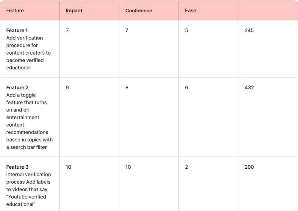
In order to identify effective resolutions for the user scenarios I had created, I initiated a feature prioritization process. This involved generating a list of potential solutions through brainstorming and subsequently conducting ICE scoring to assess their impact, confidence, and ease of implementation. Following this evaluation, the solution that emerged with the highest ICE score was the implementation of an ‘education mode’ and a refined search bar filter.
User Flow
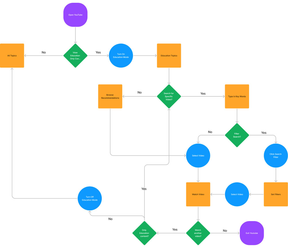
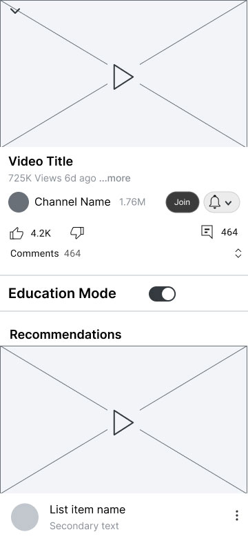
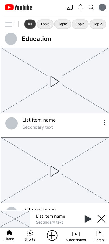
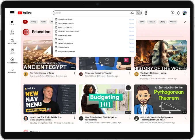
The solution I proposed involved the creation of an education-only content page and the implementation of a search bar filter. This dual approach aims to provide users with a dedicated space for educational content while enhancing their ability to narrow down searches based on their specific needs.
Design
Wireframes
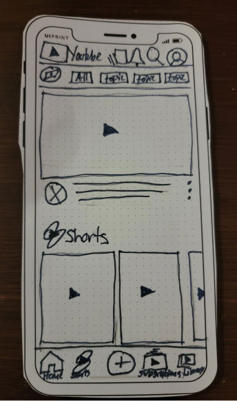
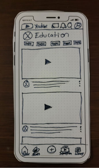
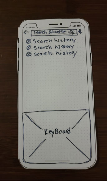
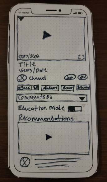
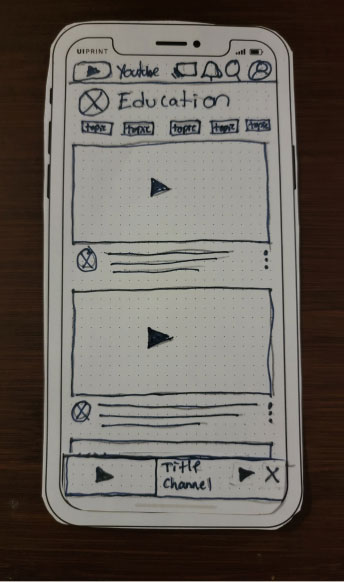
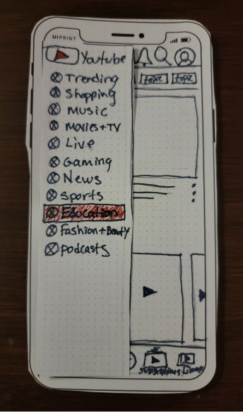
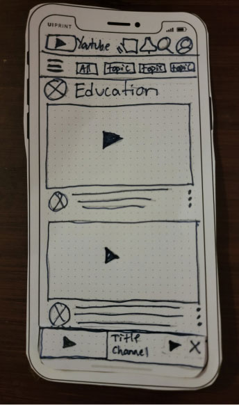
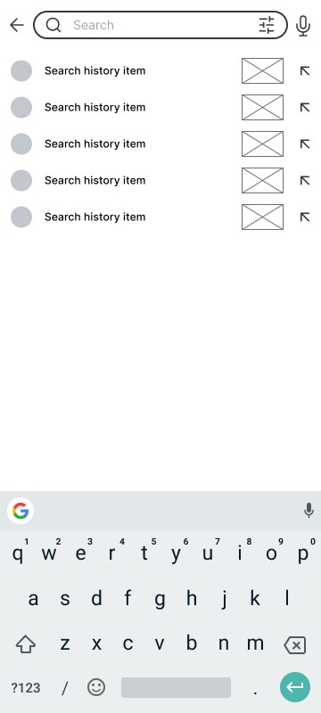
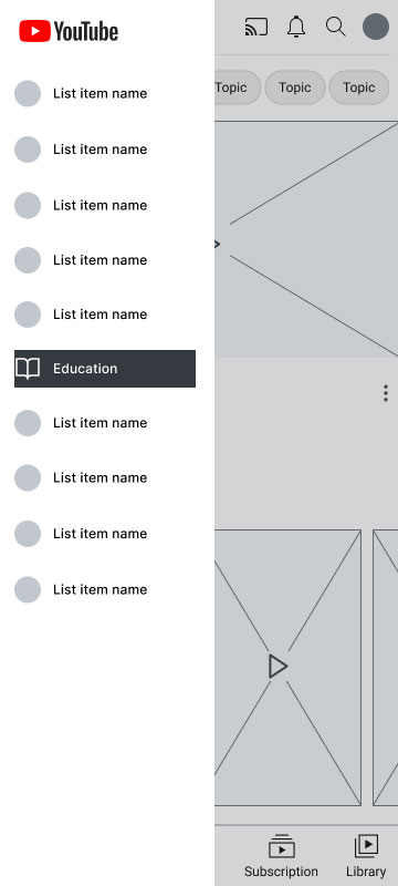
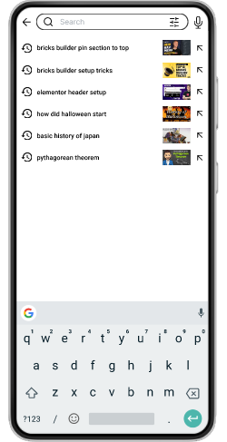
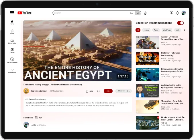
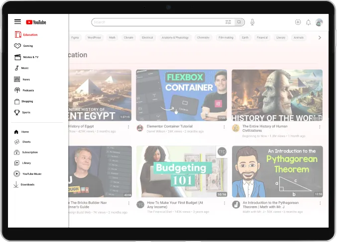
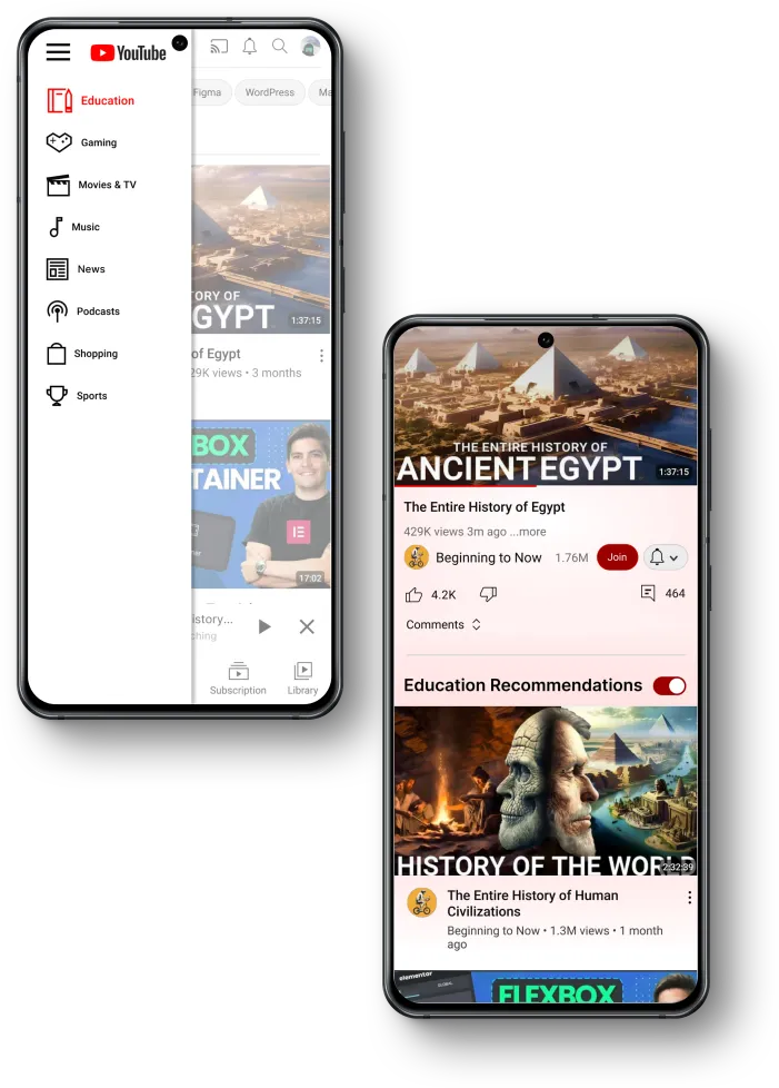
To enhance users’ capability to search for educational content, I introduced a search filter to the search bar, incorporating parameters derived from insights obtained during user interviews. The initial iteration also featured a navigation option to access an education-only page, along with a toggle switch to enable or disable education recommendations.
First Iteration
Usability Testing
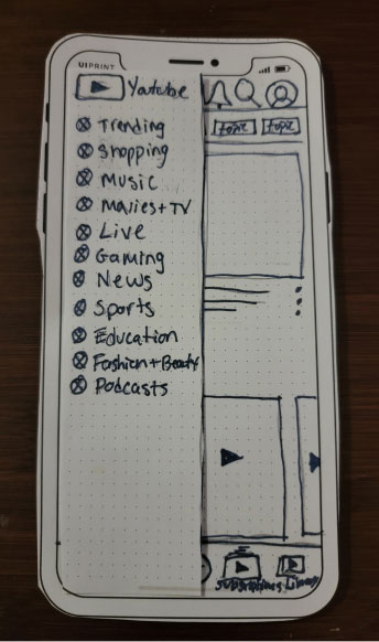
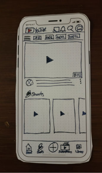
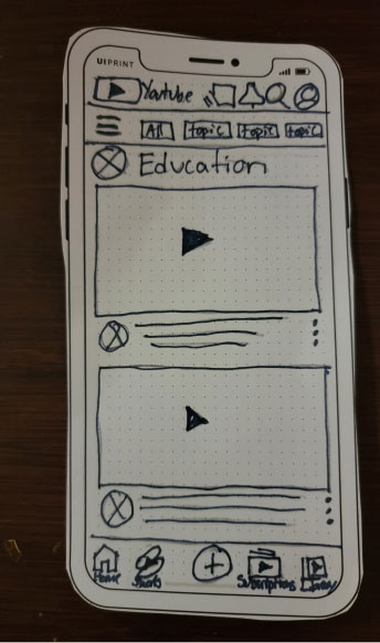
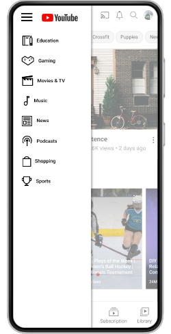
I conducted paper prototype testing with two users, assigning them tasks that involved navigating to education mode, searching for a video, and exiting education mode. Both users encountered difficulties locating the education mode button, and post-testing, both mentioned uncertainty about the purpose of the ‘explore button.’ To address this, I opted to replace the explore icon with a conventional hamburger icon commonly used for mobile navigation.
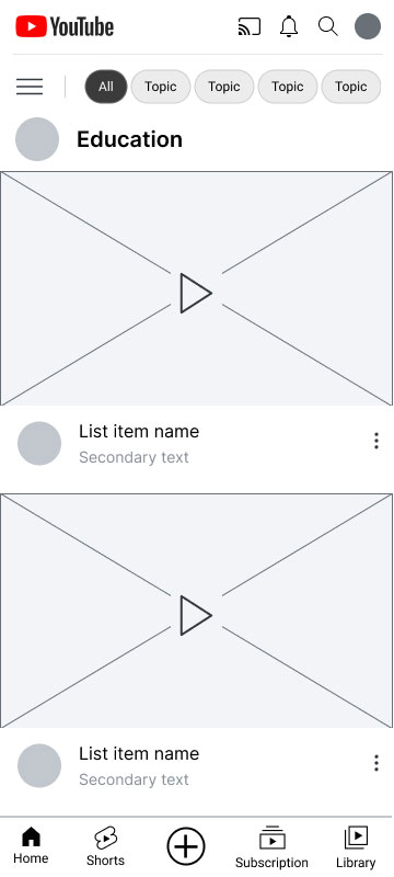
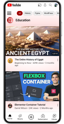
Another issue I addressed was the absence of the hamburger icon on the Education Page. During testing, both users expressed challenges in exiting the education page, feeling the need to return to the home screen or experiencing a sense of being stuck. To rectify this, I ensured the inclusion of the hamburger icon on the Education Page for more intuitive navigation.
Second Iteration
Mid-Fidelity
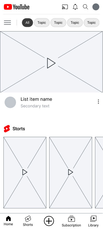
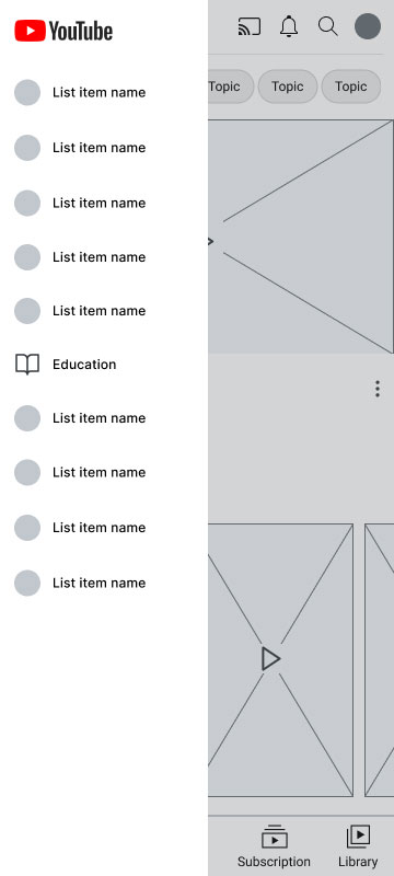
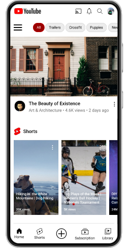
Between the second round of sketches and the mid-fidelity mockups, I maintained consistency without introducing significant changes. My emphasis was on crafting clean and intuitive layouts that would serve as a solid foundation for the upcoming high-fidelity phase. This approach ensured a seamless transition and allowed for a more focused and streamlined design process.
click to enlarge
High Fidelity
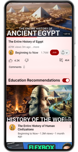
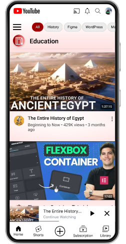
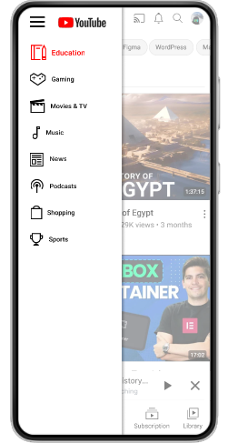
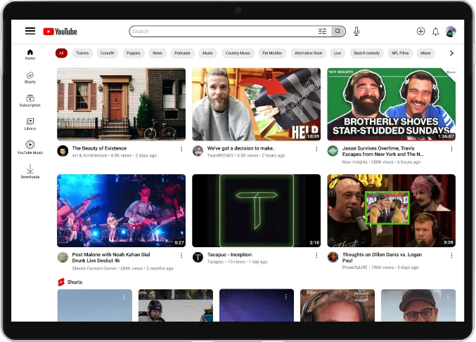
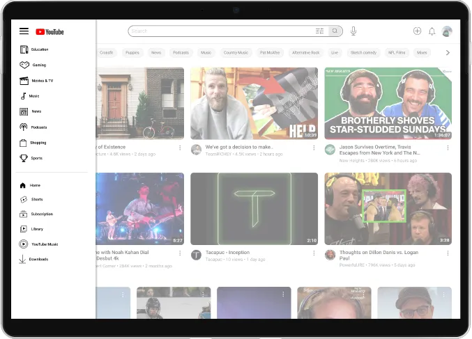
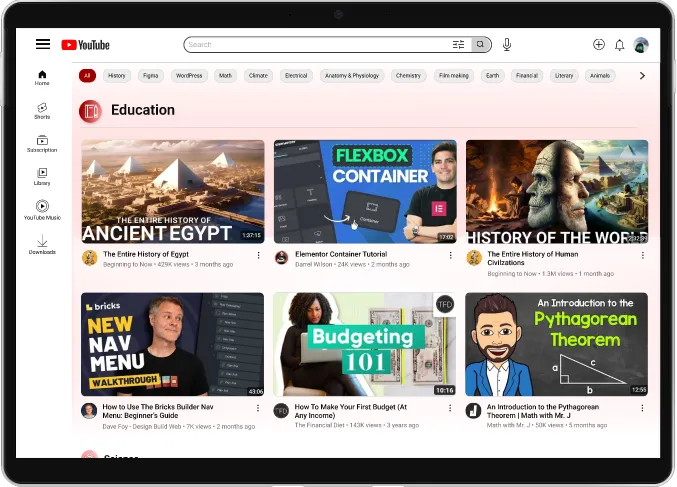
Utilizing the YouTube UI Kit, I implemented minor adjustments from mid to high-fidelity mockups. These changes included transforming the education icon from a book to a notebook and pencil and relocating it to the top of the navigation to highlight this feature. Furthermore, I introduced a color gradient across all education mode pages to distinctly differentiate them from regular YouTube. Additionally, I modified the toggle title to ‘education recommendations,’ aiming to enhance clarity and clearly communicate that toggling off would revert to regular YouTube recommendations.
Mobile
click to enlarge
Desktop
click to enlarge
Conclusion
In embarking on my first research project after years as a web designer, I gained valuable insights into the significance of crafting focused research questions, avoiding the trap of thinking too broadly and losing sight of the problem at hand. During the prototyping phase, I found myself reflecting on the questions I wished I had asked. Another significant lesson was the importance of thoroughly knowing the product. In the final stages, I discovered a ‘learning’ page under the explore icon, similar to my proposed solution for education mode. While acknowledging that awareness of this feature earlier could have enhanced the outcome, I remain confident that the solution I proposed effectively addresses the underlying problem statement.
Challenges
The primary challenge encountered in this project was formulating precise research questions aimed at addressing the defined problem statement. As a seasoned web designer, this inaugural research project pushed me to shift my design mindset. Despite the initial difficulty, the experience proved to be a valuable lesson that not only aided in subsequent projects but also contributed to my growth as a designer.

