project
Neighbors In Need Redesign and Improved Wayfinding
Project Overview
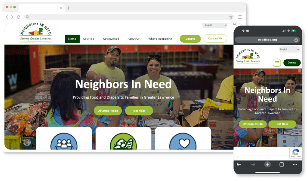
This project aimed to enhance information accessibility for people in need of food and diapers, volunteers and donors, as well as to revamp their branding to be more modern and user-friendly. I collaborated closely with my partner project manager and the client’s team on tasks such as site mapping, Figma design, and WordPress implementation.

My Role
Designer and WordPress Developer

Duration
3 Months

Team
Worked with project manager partner and directly with the client's team
Client Design and Website Goals
The client wanted a welcoming and friendly website design that prioritized easy navigation and quick access to information for those in need of food and diapers, as well as for volunteers and donors. Utilizing the knowledge I gained in my UX/UI class, I applied design principles to enhance wayfinding throughout the site.


Design Choices
The people served by the organization were the top priority, but volunteers and donations are essential for effectively assisting those in need. With this in mind, I aimed to emphasize all three groups, ensuring they were the first things users noticed. I accomplished this by using a different color for the ‘Get Help’ card and applying a drop shadow to bring the card into focus.
Recognizing that many of the individuals served were not native English speakers, it was crucial to ensure that everyone could access the information on the site, regardless of language. The client provided another website as an example that dedicated a page for each language. I proposed implementing a translation plugin, which would translate all aspects of the website. After discussion, the client still felt that having a dedicated Spanish page would be beneficial, so I implemented both solutions.
Keeping users updated on upcoming news and events was also a priority. I advised creating a blog-style page with auto-populated cards for the homepage.
Given the extensive information available for various programs, I wanted to facilitate easy navigation of the inner pages while minimizing scrolling. To achieve this, I added anchor buttons beneath the hero image on key pages, allowing users to navigate directly to the information they needed.
Conclusion
Overall, this project was a joy to work on, knowing how beneficial this non-profit is to their community and how I could help them serve those in need more effectively. I was able to utilize my diverse skill set throughout the project, including UX/UI design, graphic design, WordPress development, and problem-solving.

