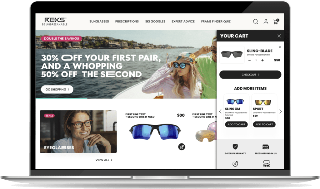
CASE STUDY
REKS.com
Wayfinding
Project Overview
As a team of interns, our project centered on enhancing the wayfinding experience for REKS Sunglasses, a manufacturer renowned for delivering high-quality, affordable, and unbreakable sunglasses through their e-commerce platform. Despite competing with premium brands such as Ray-Ban and Oakley, REKS distinguishes itself by catering to sports enthusiasts who prioritize durable, stylish, and protective eyewear.

My Role
research, iteration, design
and usability testing

Duration
5 Weeks

Team
Group Internship
Problem Statement
Sports enthusiasts exploring REKS sunglasses are enticed by their multiple offers but are overwhelmed by REKS’ many options of style, lens type, and material. Users need assistance in understanding the benefits of REKS’ multiple sunglass options while aiming to nail the product selection on the first purchase while ensuring product value.
Research
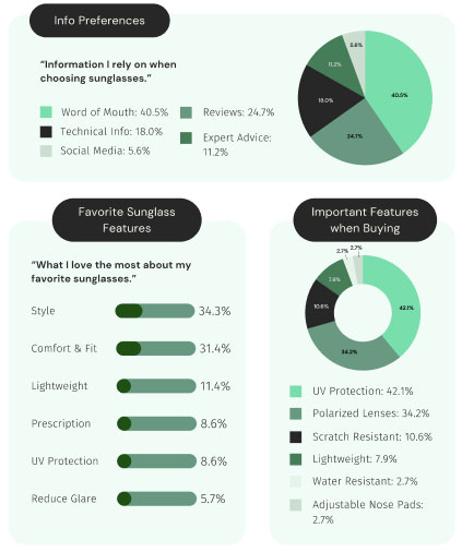
To comprehend and address the obstacles users encounter when searching for stylish, high-quality sunglasses that align with their technical and aesthetic preferences, our team collectively determined that employing user interviews, surveys, and competitive analysis would be the most effective approach.
User Research
Our team conducted two user interviews and administered a survey completed by 43 users to gather valuable insights. Collaborating with a fellow team member, we crafted interview questions and she expertly conducted the interviews.
Interview Questions
- What kind of sports do you play and how often do you play?
- Tell me about your last experience buying sunglasses.
- Walk me through the last time you bought something online.
- What features do you look for in a pair of sunglasses?
- How do sunglasses help your sports performance?
Survey Questions
- What outdoor sports do you play?
- Tennis
- Running
- Cycling
- Golf
- Skiing
- Fishing
- Hunting
- None of the above
- Other (please specify)
- How often do you engage in sports activities?
- Daily
- Several times a week
- Once a week
- Several times a month
- Once a month
- Do you currently wear sunglasses while playing sports?
- Yes
- No
- If yes, what features are important to you in sports sunglasses?
- UV protection
- Polarized lenses
- Anti-fog
- Lightweight
- Durability
- Wraparound design
- Lens color options
- Have you experienced any discomfort or issues while wearing sunglasses during sports activities?
- Yes
- No
- If yes, please describe the discomfort or issues you have experienced.
- How much are you willing to spend on sports sunglasses?
- Less than $50
- $50 – $100
- $100 – $200
- More than $200
- Price isn’t as important as getting the sunglasses I want – whether that’s cheap or expensive
- Other (please specify)
- I buy sunglasses
- online
- in-person (brick-and-mortar store)
- it varies (sometimes online, sometimes in person)
- Other (please specify)
- It’s important to me to gather as much information as possible before buying a pair of sports-related sunglasses.
- Strongly agree
- Agree
- Neither agree nor disagree
- Disagree
- Strongly disagree
- Other (please specify)
- I prefer to receive some guidance by answering a quiz about my needs and preferences, in order to choose the best sunglasses.
- Strongly agree
- Agree
- Neither agree nor disagree
- Disagree
- Strongly disagree
- Other (please specify)
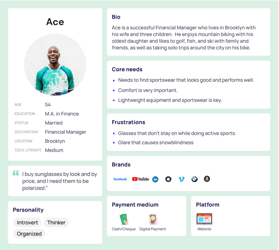
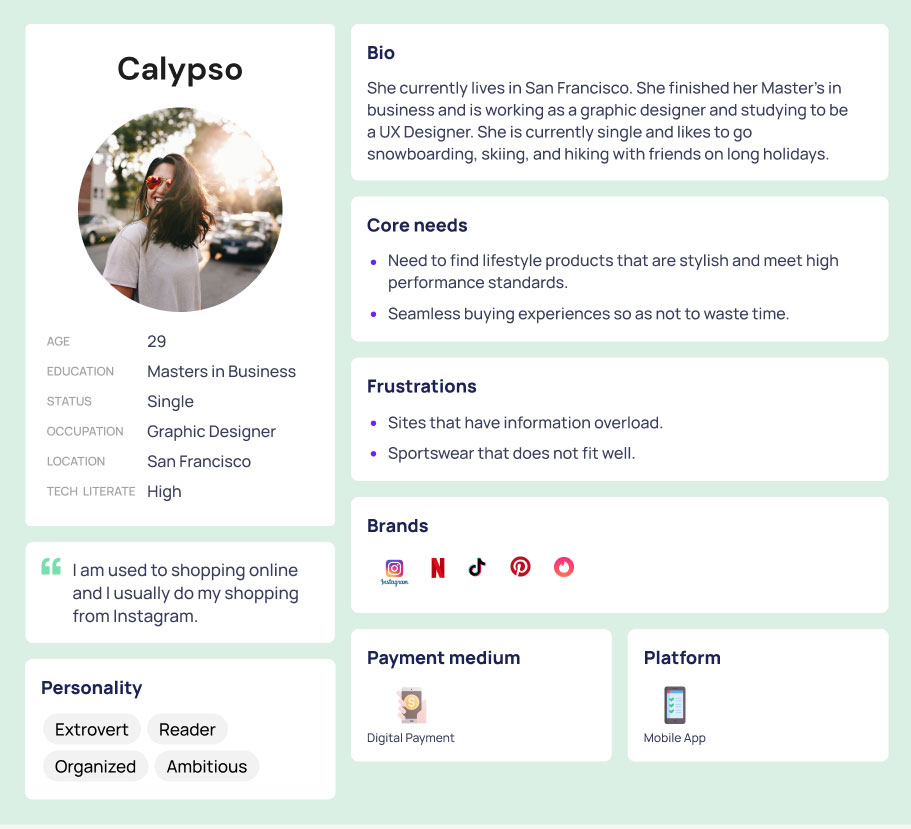
User Personas
Here are the user personas the team and I created based on the interviews and surveys.
click to enlarge
Competitor Analysis
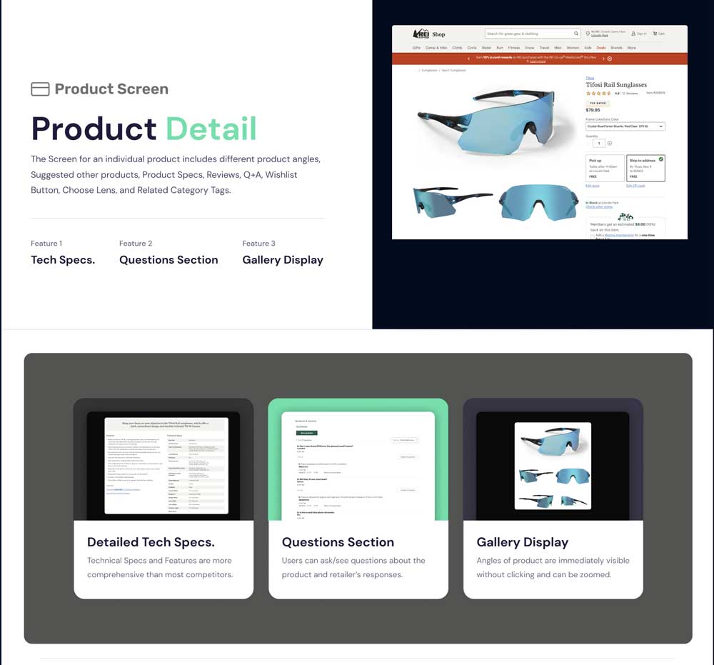
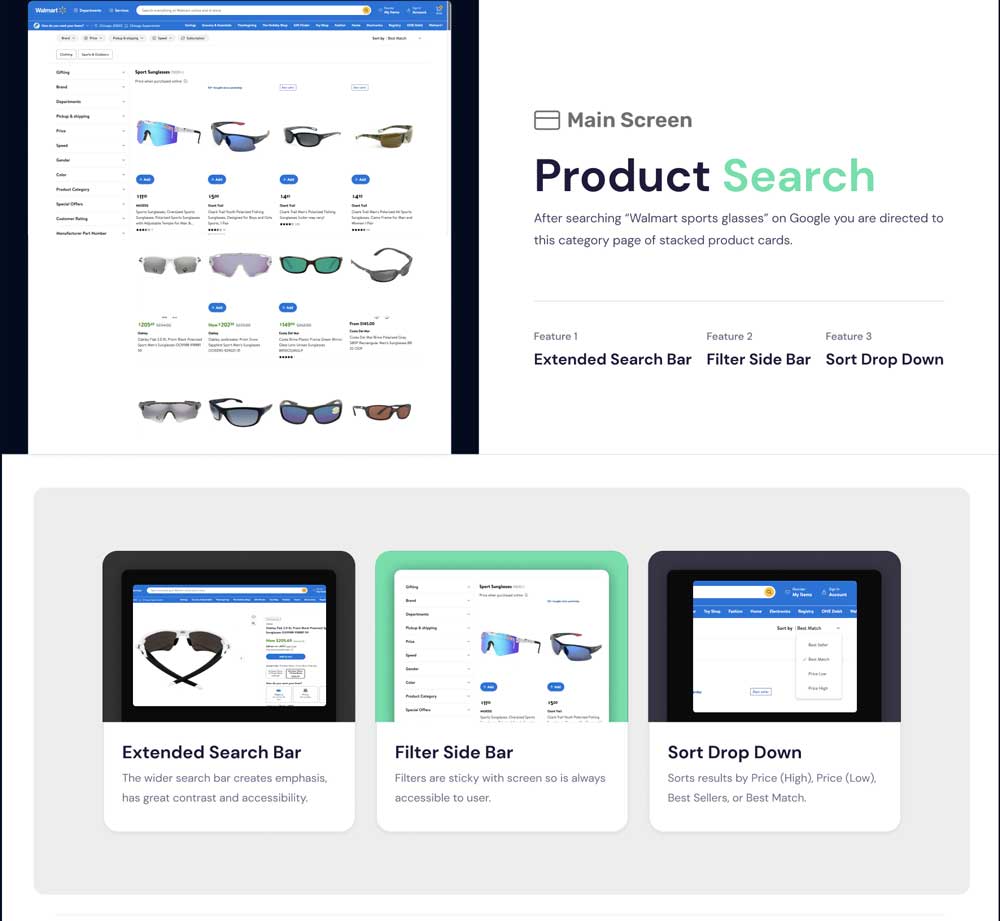
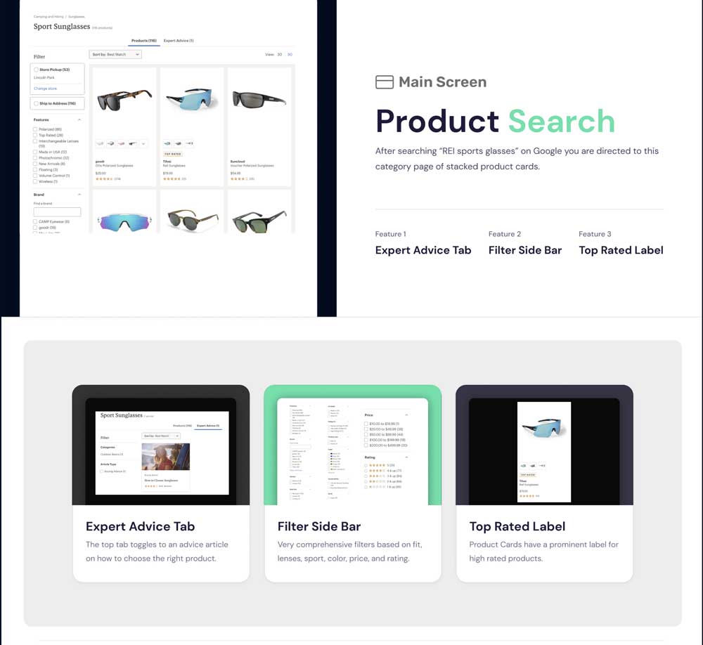
The team aimed to leverage a competitor analysis to assess and compare user experiences across features for both direct and indirect competitors. Our review encompassed Walmart, REI, RIA Eyewear, and Peppers Polarized Eyewear. Key features under scrutiny included refined categories, search filters, recommendations, hero carousel, minimalist design, frame finder quiz, and expert advice. Following the analysis, we identified focal areas for improvement: decluttering the user experience, enhancing information architecture, providing expert guidance, and optimizing discoverability.
Hypothesis
If improved navigation, product categories, product detail page, and added filtering are added to the site then users will experience better wayfinding and a speedier checkout.
Ideation
To kick off our ideation process, the team and I conducted a thorough review of the current REKS site. During our discussion, we identified key features that could be enhanced to improve the overall user experience, particularly in the area of wayfinding.
Navigation
Taking a top-down approach, we recognized the need to revamp the site's taxonomy. This involved creating more intuitive subcategories and expanding the menu to accommodate new options, ultimately enhancing the user's journey through the site.
Filtering
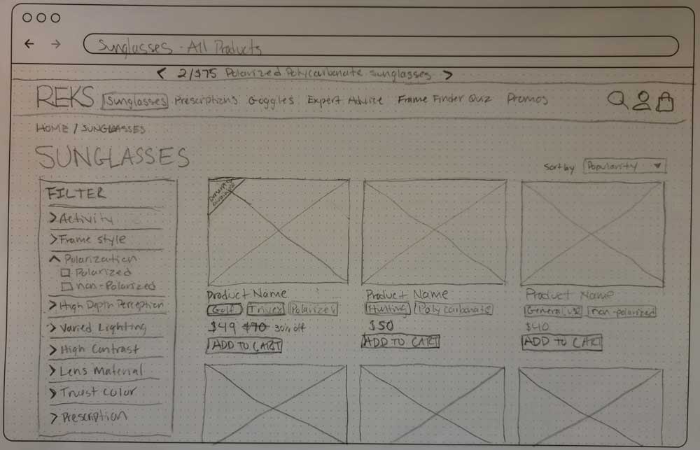
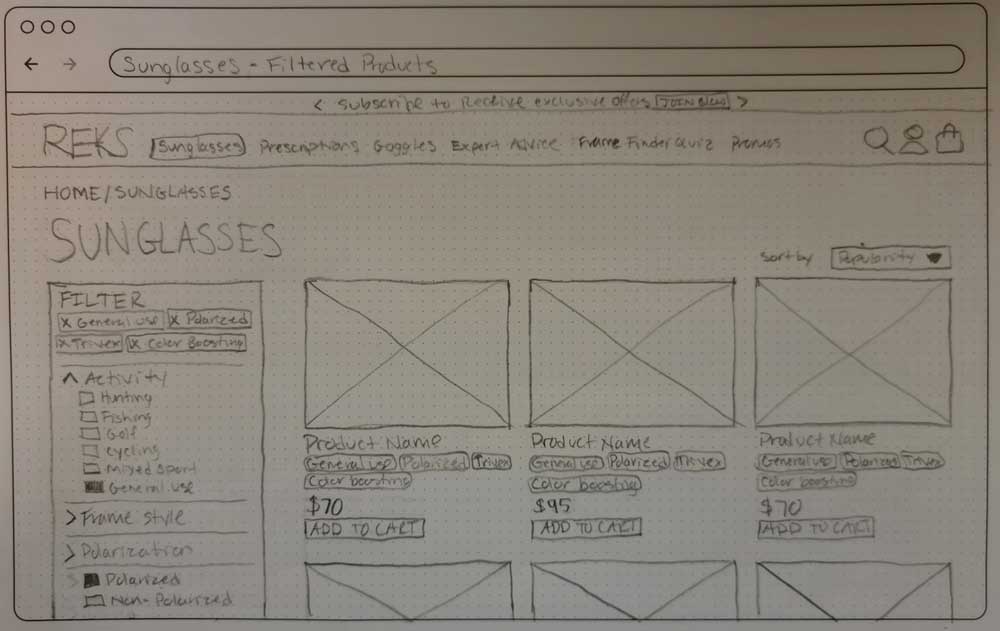
We proposed the introduction of filters within category results. This strategic move aims to streamline the overwhelming array of lenses and options on the product detail page, providing users with a quicker and more efficient path to finding the right product.
Onboarding
As part of our strategy, we suggested implementing an optional Frame Finder Quiz. This feature serves as a valuable tool for users with limited product awareness, guiding them toward expert picks tailored to their specific needs.
By focusing on these aspects—navigation, filtering, and education through a Frame Finder Quiz—we aim to elevate the user experience and make the REKS site more user-friendly and efficient.
Site Map Update
In order to incorporate these crucial features, we recognized the necessity to enhance the current site map of REKS for improved wayfinding. Our decision was to augment the top navigation with “Expert Advice” and the “Frame Finder Quiz.” These additions are geared towards assisting users with limited product awareness in identifying the most suitable sunglasses for their specific needs.
Furthermore, we opted to expand the site’s offerings by introducing additional categories and subcategories. This includes a more comprehensive range of sports, diverse lens types, prescription sunglasses, and a general use/mixed sports category. These additions are designed to empower users to refine their search for sunglasses based on their unique preferences.
1. Expert Advice
This tab/page offers frame and lens type advice depending on activity and needs.
2. Frame Finder Quiz
Low product-aware and/or overwhelmed users can take a personalization quiz for results.
3. Added Sports
Lenses that were ideal for hunting/mixed use and cycling were given their own categories.
4. Consolidated Lenses
Lenses were given additional subcategories under sports including light condition, water depth, polarization, and lens material.
5. Rx Categories
Prescription sunglasses categories are narrowed down to Polarized, Non-Polarized, and Color-Boosting Trivex.
6. General/Mixed Use
General Use and Mixed Use categories were introduced into each main sport for users that want something multifunctional but still optimized for their chosen activity.
User Flows
Based on the updated site map, our team embarked on creating multiple user flows, focusing particularly on the features earmarked for improvement. My emphasis was on refining user experiences related to navigation and filtering.
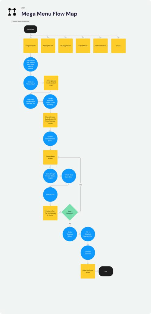
Afterward, we presented the various user flows to the team and conducted dot voting to identify the most effective solutions. The two flows selected were the mega menu with filtering and the pop-up frame finder quiz.
Mega Menu with Filtering
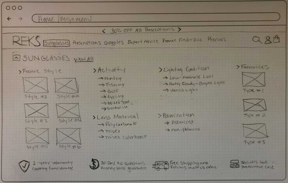
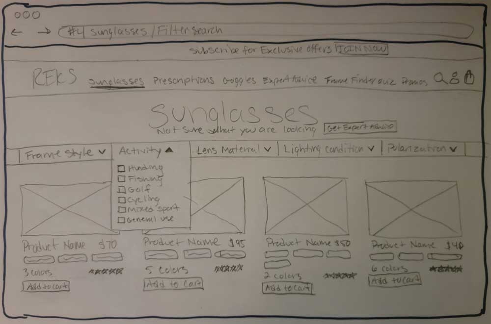
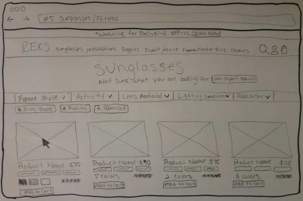
I took charge of developing the user flow for the mega menu with filtering. My rationale behind this choice was influenced by the observation that direct competitors successfully employed this feature. I believe it offered an enhanced wayfinding experience by presenting all options together, streamlining the user’s selection process. The inclusion of filtering tabs was intended to expedite the wayfinding journey, leading users to checkout faster. These filters, encompassing key features such as style, lens type, and polarization, aimed to further narrow down search results for a more tailored and efficient user experience.
Design
Wireframes
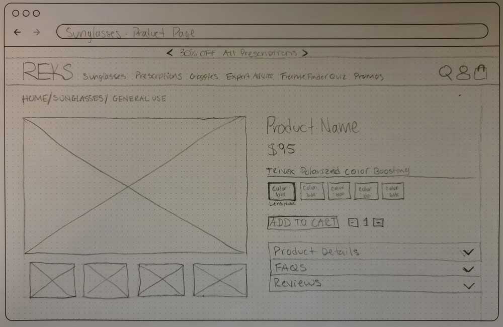
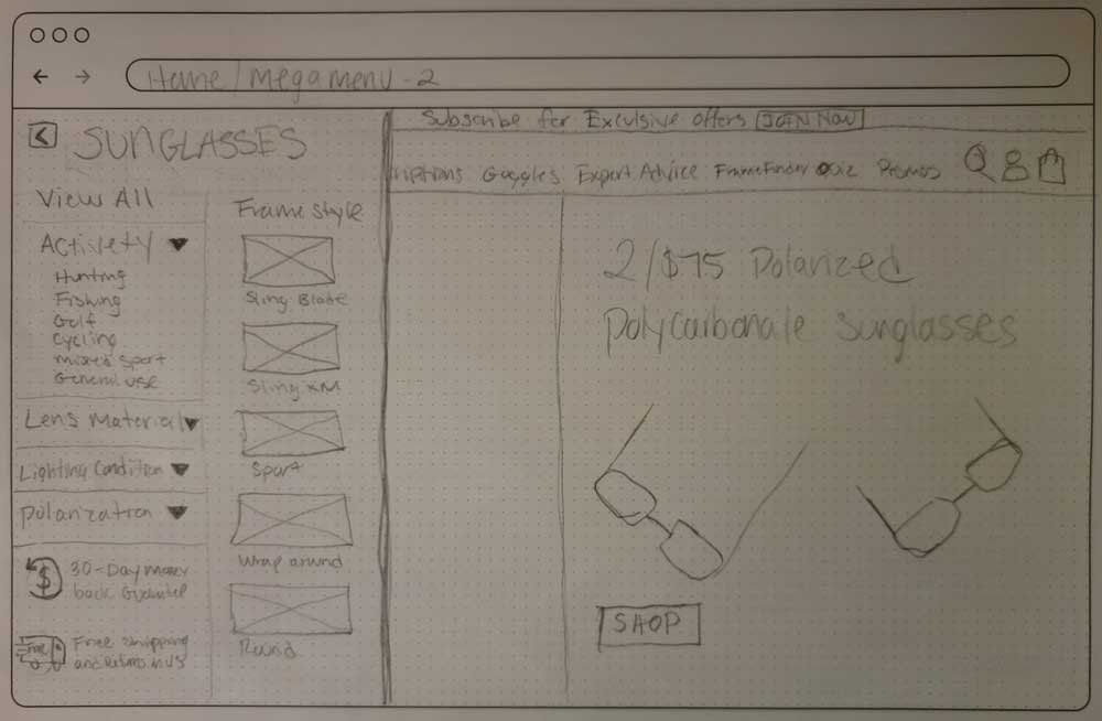
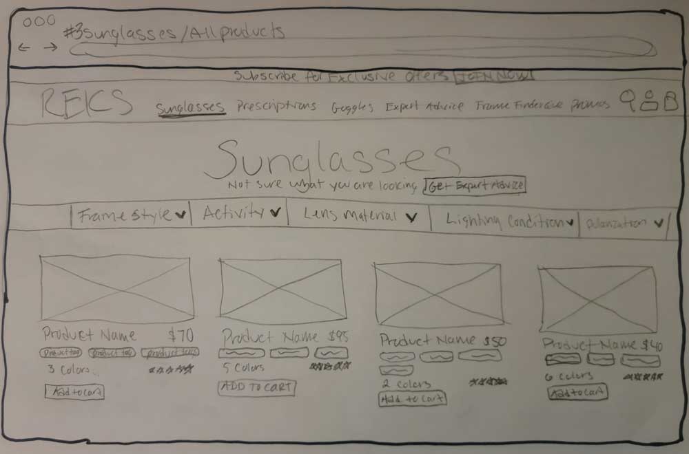
I was assigned the responsibility of crafting low-fidelity to mid-fidelity wireframes depicting the desktop mega menu navigation flow.
Option #1
click to enlarge
Option #2
click to enlarge
Summary
Following a thorough review of wireframes with the team, a unanimous decision was reached to proceed with option #1 for the mega menu and filters. While the team expressed appreciation for the hover product cards, a collective decision was made to opt for a traditional product card, considering the potential impact on development scope.
High Fidelity
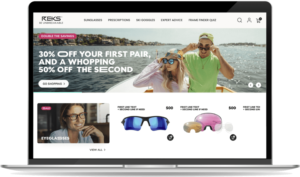
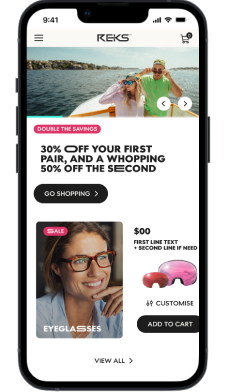
In the creation of high-fidelity designs, I assumed responsibility of crafting mobile and desktop prototypes for various screens adhering to a structured process that involves leveraging the established REKS UI kit and style guide. By seamlessly integrating these foundational elements, I ensured a cohesive and consistent visual identity throughout the design. The UI kit served as a valuable resource, providing predefined components, color schemes, and typography guidelines that not only expedite the design process but also maintain alignment with the overall brand aesthetic.
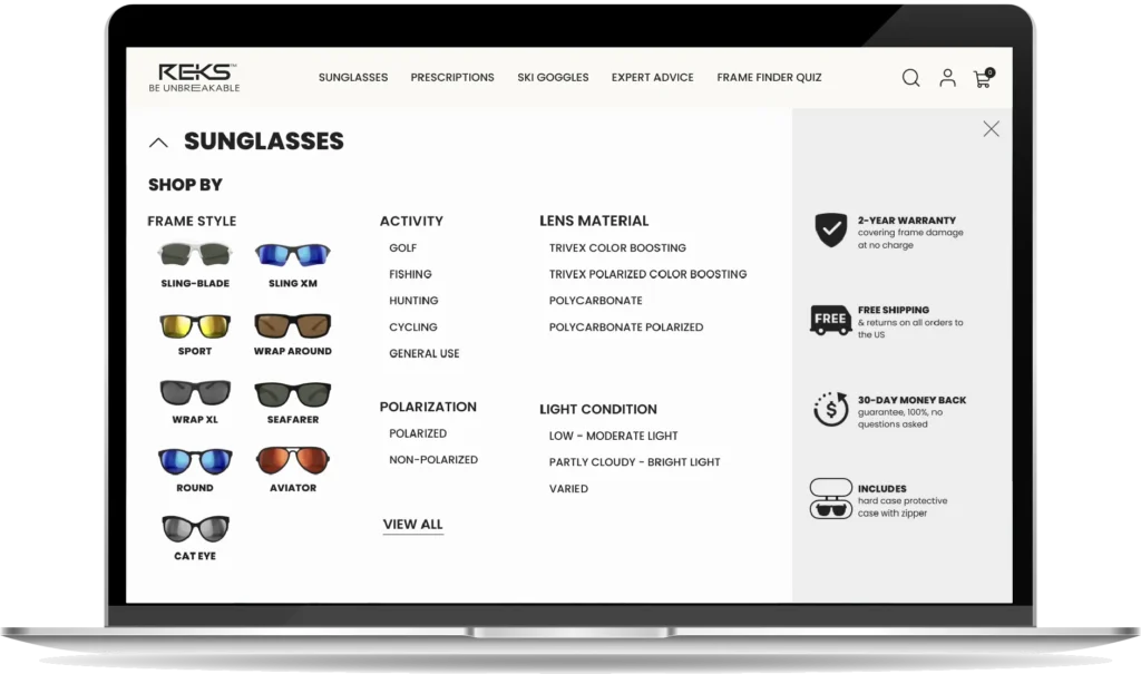
Desktop Mega Menu
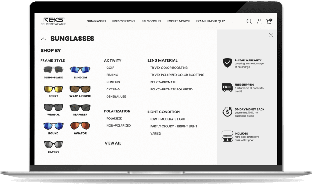
For the desktop version, I streamlined the interface by omitting the favorites option, reducing the need for additional coding. To enhance user clarity, I introduced a ‘Shop By’ label, providing more explicit guidance. Additionally, I repositioned the ‘View All’ feature to the bottom of the menu, strategically promoting an information hierarchy within the categories for a more intuitive user experience.
click to enlarge
Mobile Mega Menu
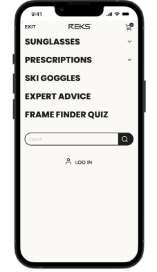
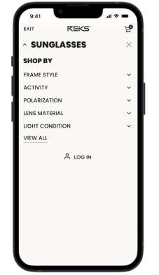
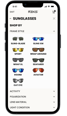
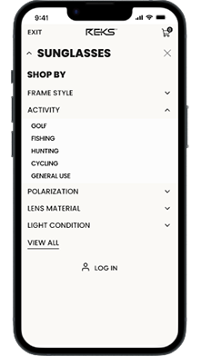
In the mobile high-fidelity prototypes, I implemented several key enhancements. Notably, I incorporated the frame style category into the accordion menu, optimizing space and improving navigational flow. The ‘View All’ option was strategically relocated within the menu for a more cohesive layout. To enhance user interaction, I introduced a convenient ‘X’ for closing the menu, and the transition was modified to a smooth downward slide, contributing to a more seamless and user-friendly experience. Additionally, the removal of the favorites feature further streamlined the mobile interface.
click to enlarge
Mobile Product Detail Page
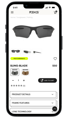
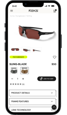
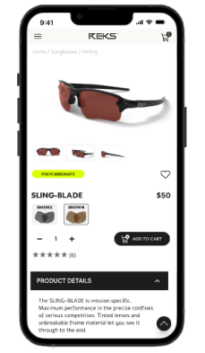
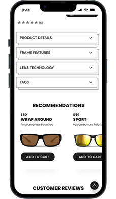
As the deadline approached, I collaborated with a team member to address mobile product details page requirements. I designed a mobile screen incorporating a dynamic image carousel that adjusts based on the selected lens color. Utilizing an accordion format for product information and integrating a horizontal recommendations carousel, I aimed to enhance user engagement and accessibility. Subsequently, close collaboration with a member of the team ensured seamless feature alignment between the desktop and mobile platforms, fostering a consistent and cohesive user experience across devices.
click to enlarge
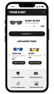
Desktop and Mobile Cart
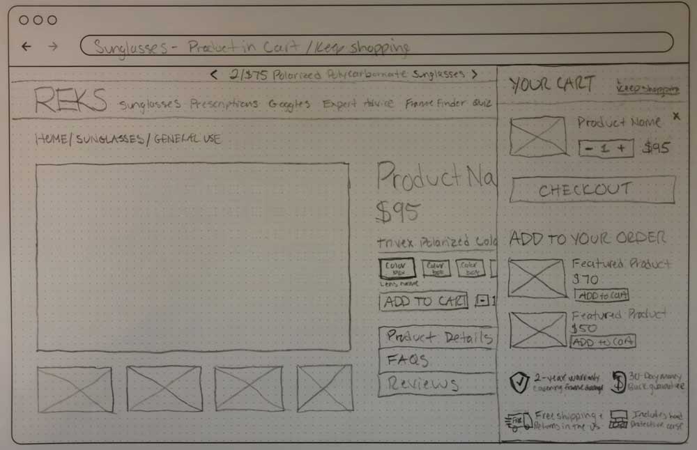
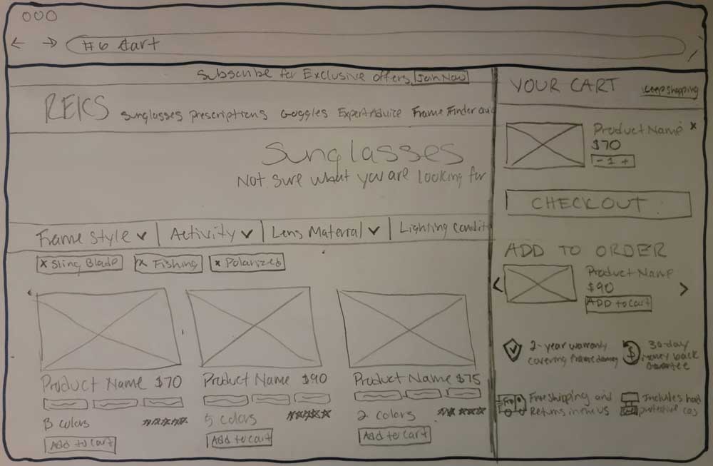
In the final days leading up to our deadline, I identified a crucial gap in our design – the absence of high-fidelity cart screens for both desktop and mobile. Leveraging the cart concept from my second sketch, I made strategic adjustments, replacing the ‘Keep Shopping’ prompt with an ‘X’ to encourage users to proceed to checkout seamlessly. To ensure visual consistency, I aligned the layout of the recommendation cards in the cart with those on the product details page, aiming for a unified and polished user experience.
click to enlarge
Usability Testing
We planned on conducting usability testing I created a user task in anticipation of conducting autonomous user testing with Maze. Due to limited time and resources, we were unable to conduct usability testing before our presentation to the client. Here is the task I formulated:
User Task
You are looking to purchase sunglasses for a friend who is a serious golfer and loves fishing. Navigate through the site to purchase the best pair of sunglasses for your friend.
- How did you find the sunglasses you chose for your friend?
- When did you add the product to the card?
- Scale – How well could you explain why you chose those sunglasses?
- How was your experience navigating through the site?
- What did you like about the purchase process?
- What did you NOT like about the purchase process?
- Would you buy sunglasses from this site again?
Conclusion
We received positive feedback after presenting to the client. They appreciated the three main features we offered: the mega menu, product filtering, and the frame finder quiz. As this project was part of a group internship, we are uncertain whether REKS will proceed with our solutions at this time.
Challenges
As a team of interns with diverse skills and experiences, we encountered several challenges, notably in communication, time management, and client resource availability.
Being a newly formed team, we faced difficulties in delegating key tasks during the design phase. This led to instances where team members did not leverage pre-existing components, resulting in time wastage and additional work to ensure consistency across desktop and mobile screens. A contributing factor was the change in the UI kit from the client mid-project.
Our most significant challenge was not being able to conduct usability testing to identify any design gaps in our proposed solutions due to wasted time and lack of resources from the client.
